This post may contain affiliate links. Please see my disclosure policy for details.
The Complete Guide to Board Game Aesthetic: Transform Your Gaming Experience Through Visual Design
Contents
- The Complete Guide to Board Game Aesthetic: Transform Your Gaming Experience Through Visual Design
- Why Board Game Aesthetics Matter More Than You Think
- The Foundation: Visual Clarity That Actually Works
- Essential Icon Design Principles
- Typography That Doesn’t Fight You
- Color Psychology: Making Games Feel Right
- Strategic Color Choices
- Color Accessibility Considerations
- Minimalist Design: When Less Creates More
- The Minimalist Advantage
- Implementing Minimalist Principles
- Current Trends Reshaping Board Game Aesthetics
- Premium Quality and Collectible Appeal
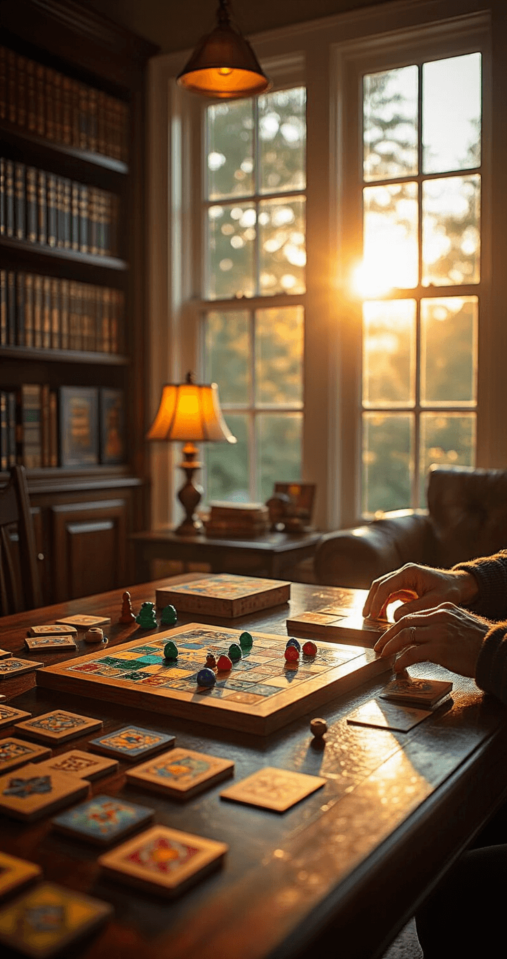
Board game aesthetic has completely transformed how I experience tabletop gaming, turning simple cardboard into immersive worlds that captivate players before they even read the rules.
You know that feeling when you open a game box and immediately think “wow, this looks incredible”? That’s the power of thoughtful board game design working its magic.
I’ve spent years collecting, playing, and analyzing what makes some games visually stunning while others fall flat. The difference isn’t just pretty pictures – it’s a carefully orchestrated blend of art, functionality, and player psychology that can make or break your gaming experience.
Why Board Game Aesthetics Matter More Than You Think
Your brain makes decisions about games within seconds of seeing them.
I learned this the hard way when I passed over countless amazing games simply because their covers didn’t grab me. Meanwhile, I bought beautifully designed duds that looked fantastic but played terribly.
Here’s what I discovered:
- Visual appeal directly impacts enjoyment – even identical gameplay feels different with better aesthetics
- Clear design reduces learning time – you’ll spend less time explaining rules and more time playing
- Memorable visuals create lasting experiences – the games you remember most likely have distinctive visual identities
The board game market has exploded to $27 billion precisely because designers finally understand that aesthetics aren’t superficial – they’re essential.

The Foundation: Visual Clarity That Actually Works
Icons and symbols are the secret language of great board games.
I’ve watched countless game nights derail because players couldn’t quickly identify what different symbols meant. The best games solve this through redundant visual cues that work together seamlessly.
Essential Icon Design Principles
Shape + Color + Context = Clarity
Every effective board game icon follows this formula:
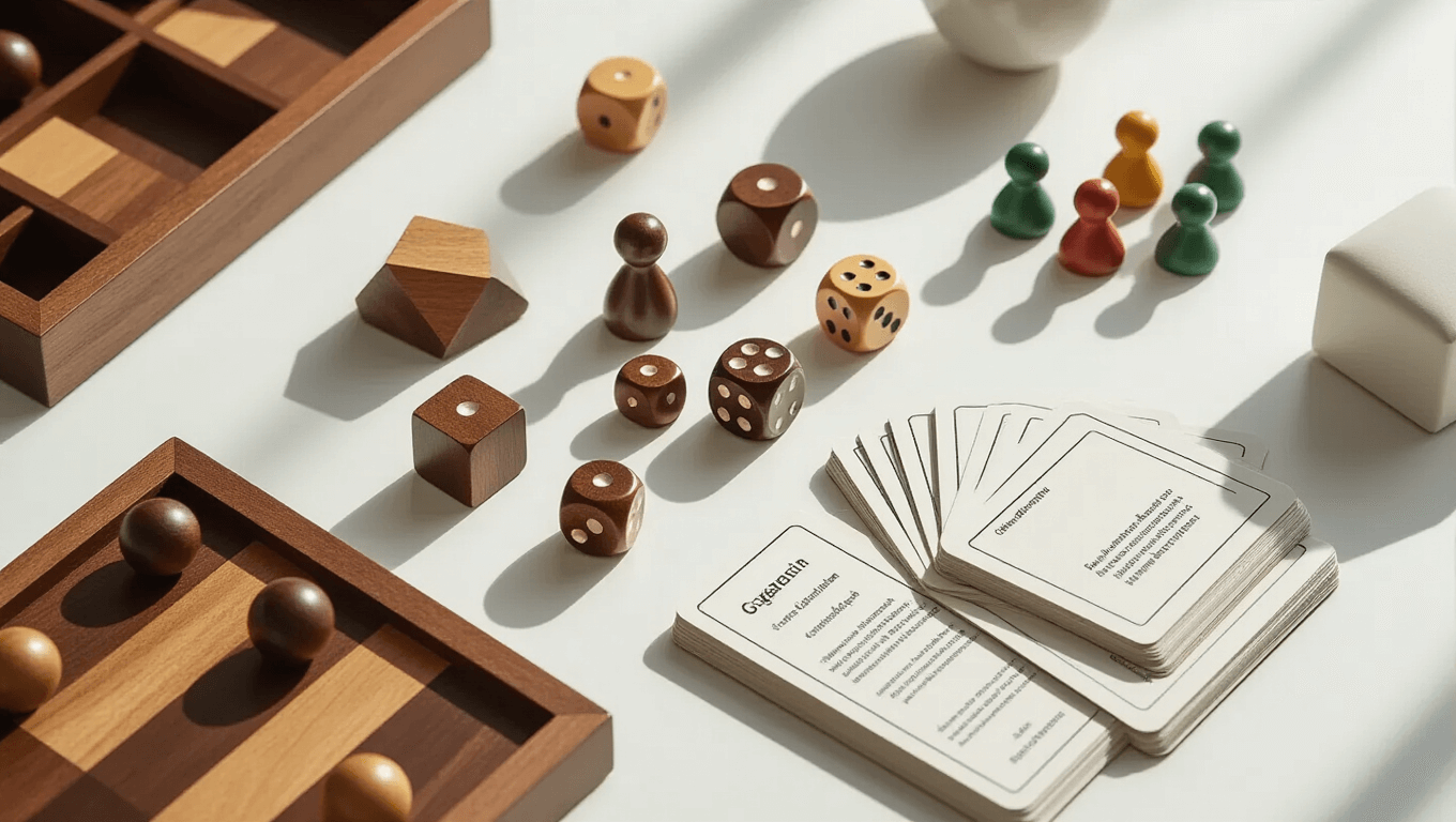
- Distinctive shapes that look different even in silhouette
- Consistent color coding throughout all components
- Contextual placement that reinforces meaning
For example, Wingspan uses bird illustrations alongside clear symbols, making it accessible even to younger players.
Typography That Doesn’t Fight You
Readable text saves friendships.
I’ve seen too many arguments sparked by unclear card text or confusing rule formatting. The games I reach for repeatedly share these text design elements:
- High contrast between text and background
- Consistent font sizing across similar elements
- Logical information hierarchy that guides your eye naturally
- Adequate white space preventing visual cramping

Color Psychology: Making Games Feel Right
Colors trigger emotions before conscious thought kicks in.
The most successful board games use color psychology to enhance their themes naturally. I noticed this pattern across my favorite games long before I understood the science behind it.
Strategic Color Choices
Warm colors (reds, oranges, yellows) create excitement and urgency. Games like Azul use vibrant tile colors to make pattern-building feel joyful rather than mathematical.
Cool colors (blues, greens, purples) promote calm, strategic thinking. Economic games often lean heavily on these palettes to encourage thoughtful decision-making.
Neutral colors (browns, grays, blacks) provide visual rest and highlight important elements. They’re the unsung heroes that make colorful components pop.
Color Accessibility Considerations
Roughly 8% of men and 0.5% of women have some form of color blindness.
The games I recommend most often include these accessibility features:
- Shape differentiation alongside color coding
- Pattern overlays on colored regions
- High contrast combinations that work for various vision types
- Consistent positional cues reducing color dependence

Minimalist Design: When Less Creates More
Minimalist board game aesthetics focus player attention where it matters most.
I initially resisted minimalist games, thinking they looked boring or unfinished. Then I played Abstract Strategy games that proved visual restraint can be incredibly powerful.
The Minimalist Advantage
Reduced cognitive load means players process information faster. When games eliminate visual noise, your brain can focus on strategy instead of parsing complex artwork.
Timeless appeal keeps minimalist games looking fresh years later. While heavily illustrated games can feel dated, clean designs age gracefully.
Universal accessibility crosses cultural and language barriers more easily. Simple, clear visuals communicate effectively regardless of background.
Implementing Minimalist Principles
Strategic use of white space creates visual breathing room. The best minimalist games use empty areas as deliberately as filled ones.
Limited color palettes typically stick to 2-4 main colors plus neutrals. This constraint forces designers to be more creative with differentiation.
Essential elements only – every visual component serves a clear purpose. Decorative elements either support gameplay or get removed entirely.

Current Trends Reshaping Board Game Aesthetics
The industry has shifted from graphic design as afterthought to design-driven development.
I’ve watched this transformation firsthand over the past decade. Games now launch with graphic designers and mechanics developers working together from day one rather than art being applied to finished systems.
Premium Quality and Collectible Appeal
Production values have skyrocketed across all price points.
Even $30 games now feature:
- Thick, substantial game boards that feel premium
- Detailed miniatures rivaling collectible figures
- Artwork quality matching graphic novels and art books
- Custom storage solutions that


